- myFICO® Forums
- Types of Credit
- Credit Cards
- Re: Your most (and least) good looking cards?
Options
- Subscribe to RSS Feed
- Mark Topic as New
- Mark Topic as Read
- Float this Topic for Current User
- Bookmark
- Subscribe
- Mute
- Printer Friendly Page
Turn on suggestions
Auto-suggest helps you quickly narrow down your search results by suggesting possible matches as you type.
Showing results for
Your best (and worst) looking cards?
Is your credit card giving you the perks you want?
Browse credit cards from a variety of issuers to see if there's a better card for you.
- Mark as New
- Bookmark
- Subscribe
- Mute
- Subscribe to RSS Feed
- Permalink
- Report Inappropriate Content
06-25-2013
10:38 AM
06-25-2013
10:38 AM
Your best (and worst) looking cards?
So, this isn't really a serious question, and I'm sure there have been plenty of similar threads in the past, but yet... Which cards are your personal favorites design-wise? And which ones are the ugly ducklings?
I have to admit that I don't have a single credit card that I would be able to call beautiful. My least favorite would have to be the Amex BCE - I was so excited to get that card, and yet so disappointed with its design! First of all, it's clear - the pictures give the impression of it being white, but it's not. I've swiped it about 4 times, and it's already thoroughly scratched. The big blue hologram thing also scratches like crazy, doesn't really have any interesting image in there (just a large blue shiny square with a tiny c in the middle) and to top it off, one of the edges of mine is crooked (yes, before you ask, I am OCD when it comes to symmetry) AND all of the numbers that are embossed on the clear parts are really difficult to read.
Oh, Amex, I still love you, but why did you think all this would be a good idea?..
And my current favorite is probably the Chase Freedom. Which is ironic, because in pictures it looked thoroughly boring, and I wasn't expecting much after the Chase Amazon card. However, the Freedom came as a nice surprise. I can't say it's a masterpiece, but I thought the blue-green color (which looks solid blue in pictures) and the green edge were very nice touches.
BoA Secured $500 (closed) | OneStopPlus $900 | Chase Amazon $4600 (AU) | Amex BCE $6000 |
Chase Freedom $3000 | BoA TravelRewards Signature Visa $5000 | CSP $17 000 | BCP $27 000
Building credit since 04/2011 | CreditKarma 763 | CreditSesame 795 | Gardening since 01/31/2014
Chase Freedom $3000 | BoA TravelRewards Signature Visa $5000 | CSP $17 000 | BCP $27 000
Building credit since 04/2011 | CreditKarma 763 | CreditSesame 795 | Gardening since 01/31/2014
Message 1 of 144
0
Kudos
143 REPLIES 143
- Mark as New
- Bookmark
- Subscribe
- Mute
- Subscribe to RSS Feed
- Permalink
- Report Inappropriate Content
06-25-2013
10:43 AM
06-25-2013
10:43 AM
Re: Your most (and least) good looking cards?
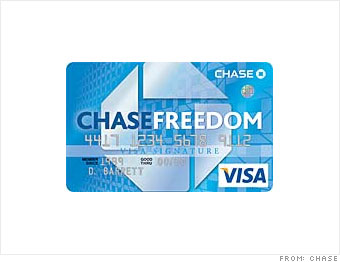
I liked the old Freedom design.
Scores 5/15/2016 (clean reports!): TU Walmart FICO: 696 | EQ FICO: 679 | EX AMEX FICO: 680
In my new wallet: American Express Green EMV: PSL $2000 | BankAmericard Cash Rewards Visa EMV: $2500 | Citi AAdvantage Platinum Select World MasterCard: $6400 | Barclaycard Arrival World MasterCard: $1000 | Discover IT: $2500 | Amazon Rewards Visa Signature: $1500 | Chase Freedom: $1500 | Capital One QuicksilverOne MasterCard: $2100 | Target: $2800 | J.Crew $21,550 | Marvel (Captain America) MasterCard: $6000
In my new wallet: American Express Green EMV: PSL $2000 | BankAmericard Cash Rewards Visa EMV: $2500 | Citi AAdvantage Platinum Select World MasterCard: $6400 | Barclaycard Arrival World MasterCard: $1000 | Discover IT: $2500 | Amazon Rewards Visa Signature: $1500 | Chase Freedom: $1500 | Capital One QuicksilverOne MasterCard: $2100 | Target: $2800 | J.Crew $21,550 | Marvel (Captain America) MasterCard: $6000
Message 2 of 144
0
Kudos
- Mark as New
- Bookmark
- Subscribe
- Mute
- Subscribe to RSS Feed
- Permalink
- Report Inappropriate Content
06-25-2013
10:47 AM
06-25-2013
10:47 AM
Re: Your most (and least) good looking cards?
@injustifiiable wrote:I liked the old Freedom design.
Is this the way the Freedom looks now? Mine is totally different. Oh wait...mine isn't a signature, so maybe that's the difference.
My least favorite design card is the Amex BCE/BCP. Like OP, I was disappointed when I got the card in the mail. I expected it to be heavier and white...not clear. But, it swipes, so I won't complain too much.
AmEx Green NPSL | Amex BCP 16K | Citi Simplicity 10k | Discover IT 9K | Chase Slate 7.5K | Amex Hilton HHonors Surpass 7K | Capital One QuickSilver 6K | Home Depot 5k | Chase Freedom 4.5K | LOC 2.5K
Message 3 of 144
0
Kudos
- Mark as New
- Bookmark
- Subscribe
- Mute
- Subscribe to RSS Feed
- Permalink
- Report Inappropriate Content
06-25-2013
10:50 AM
06-25-2013
10:50 AM
Re: Your most (and least) good looking cards?
@frugalQ wrote:
@injustifiiable wrote:I liked the old Freedom design.
Is this the way the Freedom looks now? Mine is totally different. Oh wait...mine isn't a signature, so maybe that's the difference.
My least favorite design card is the Amex BCE/BCP. Like OP, I was disappointed when I got the card in the mail. I expected it to be heavier and white...not clear. But, it swipes, so I won't complain too much.
No, this is the old one. The new one looks like this:
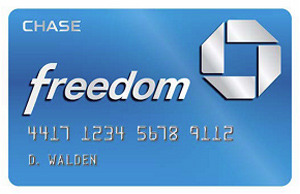
Signature or World would go below the Visa/MasterCard logo. I like that better than that awkward looking strip in the middle.
Scores 5/15/2016 (clean reports!): TU Walmart FICO: 696 | EQ FICO: 679 | EX AMEX FICO: 680
In my new wallet: American Express Green EMV: PSL $2000 | BankAmericard Cash Rewards Visa EMV: $2500 | Citi AAdvantage Platinum Select World MasterCard: $6400 | Barclaycard Arrival World MasterCard: $1000 | Discover IT: $2500 | Amazon Rewards Visa Signature: $1500 | Chase Freedom: $1500 | Capital One QuicksilverOne MasterCard: $2100 | Target: $2800 | J.Crew $21,550 | Marvel (Captain America) MasterCard: $6000
In my new wallet: American Express Green EMV: PSL $2000 | BankAmericard Cash Rewards Visa EMV: $2500 | Citi AAdvantage Platinum Select World MasterCard: $6400 | Barclaycard Arrival World MasterCard: $1000 | Discover IT: $2500 | Amazon Rewards Visa Signature: $1500 | Chase Freedom: $1500 | Capital One QuicksilverOne MasterCard: $2100 | Target: $2800 | J.Crew $21,550 | Marvel (Captain America) MasterCard: $6000
Message 4 of 144
0
Kudos
- Mark as New
- Bookmark
- Subscribe
- Mute
- Subscribe to RSS Feed
- Permalink
- Report Inappropriate Content
06-25-2013
10:50 AM
06-25-2013
10:50 AM
Re: Your most (and least) good looking cards?
@recordaras wrote:
And my current favorite is probably the Chase Freedom. Which is ironic, because in pictures it looked thoroughly boring, and I wasn't expecting much after the Chase Amazon card. However, the Freedom came as a nice surprise. I can't say it's a masterpiece, but I thought the blue-green color (which looks solid blue in pictures) and the green edge were very nice touches.
Funny you should mention the green edge on the Freedom as I get more comoments on that feature than I do my CSP card.
Chase Sapphire Preferred 20k | Amex Delta Platinum 20k | Amex Hilton Aspire 20k | US Bank Cash+ 25k | Chase Amazon Prime 25k | Barclaycard Aviator Red 40k | Bank of America Alaska Airlines 42k | Chase Marriott 50k | Discover It 50.3k | Amex EDP 52k | Citi Thank You Premier 56K | Bank of America BBR 57.9k
Message 5 of 144
0
Kudos
- Mark as New
- Bookmark
- Subscribe
- Mute
- Subscribe to RSS Feed
- Permalink
- Report Inappropriate Content
06-25-2013
10:50 AM
06-25-2013
10:50 AM
Re: Your most (and least) good looking cards?
My favorite card design is either my Discover card, I have the mixtape design or my Amex BCE, lol.
My least favorite design is my Chase Sapphire, the pics of it made it look so pretty, but when I got it was just blah. And my Barclay Apple card isn't that grand. It just a simple white card, not spectacular.
AMEX BCE: 5k; Barclay Apple: 2.5k; BoA CB: 3k; BoA BBR 4.2k; BoA Travel: 8k; Chase Sapphire: 5k; Chase Freedom: 6k; Citi Diamond: 3k; Discover IT: 9k

June 2013 FICOs: TU: 763; EX: 754; EQ: 764 (was 747 9/2012). Last app 2/20/2014 Garden until 3/2015
June 2013 FICOs: TU: 763; EX: 754; EQ: 764 (was 747 9/2012). Last app 2/20/2014 Garden until 3/2015
Message 6 of 144
0
Kudos
- Mark as New
- Bookmark
- Subscribe
- Mute
- Subscribe to RSS Feed
- Permalink
- Report Inappropriate Content
06-25-2013
10:52 AM
06-25-2013
10:52 AM
Re: Your most (and least) good looking cards?
Love my Chase Sapphire. Very clean look. Amex PRG is decent. And lastly Cap1 lets me customize my image which is really cool.
__
Freedom, Sapphire, Slate - HHonors, PRG, BCE - Cap1 Platinum - Discover IT - Tiffany & Co - Jared - Best Buy Citi -
Freedom, Sapphire, Slate - HHonors, PRG, BCE - Cap1 Platinum - Discover IT - Tiffany & Co - Jared - Best Buy Citi -
Message 7 of 144
0
Kudos
- Mark as New
- Bookmark
- Subscribe
- Mute
- Subscribe to RSS Feed
- Permalink
- Report Inappropriate Content
06-25-2013
10:53 AM
06-25-2013
10:53 AM
Re: Your most (and least) good looking cards?
I personalized my Capital One card. I'm into trains so I did it with a photo of one of my favorite locomotives.
The ugliest one would be my Credit One...lol. I can customize that one too but they have the nerve to want $10 to do so. SMH.
I have a few store cards, and they are all ugly as well for the record.
Scores 5/15/2016 (clean reports!): TU Walmart FICO: 696 | EQ FICO: 679 | EX AMEX FICO: 680
In my new wallet: American Express Green EMV: PSL $2000 | BankAmericard Cash Rewards Visa EMV: $2500 | Citi AAdvantage Platinum Select World MasterCard: $6400 | Barclaycard Arrival World MasterCard: $1000 | Discover IT: $2500 | Amazon Rewards Visa Signature: $1500 | Chase Freedom: $1500 | Capital One QuicksilverOne MasterCard: $2100 | Target: $2800 | J.Crew $21,550 | Marvel (Captain America) MasterCard: $6000
In my new wallet: American Express Green EMV: PSL $2000 | BankAmericard Cash Rewards Visa EMV: $2500 | Citi AAdvantage Platinum Select World MasterCard: $6400 | Barclaycard Arrival World MasterCard: $1000 | Discover IT: $2500 | Amazon Rewards Visa Signature: $1500 | Chase Freedom: $1500 | Capital One QuicksilverOne MasterCard: $2100 | Target: $2800 | J.Crew $21,550 | Marvel (Captain America) MasterCard: $6000
Message 8 of 144
0
Kudos
- Mark as New
- Bookmark
- Subscribe
- Mute
- Subscribe to RSS Feed
- Permalink
- Report Inappropriate Content
06-25-2013
10:59 AM
06-25-2013
10:59 AM
Re: Your most (and least) good looking cards?
@injustifiiable wrote:I liked the old Freedom design.
Oh interesting, I hadn't seen that one!
BoA Secured $500 (closed) | OneStopPlus $900 | Chase Amazon $4600 (AU) | Amex BCE $6000 |
Chase Freedom $3000 | BoA TravelRewards Signature Visa $5000 | CSP $17 000 | BCP $27 000
Building credit since 04/2011 | CreditKarma 763 | CreditSesame 795 | Gardening since 01/31/2014
Chase Freedom $3000 | BoA TravelRewards Signature Visa $5000 | CSP $17 000 | BCP $27 000
Building credit since 04/2011 | CreditKarma 763 | CreditSesame 795 | Gardening since 01/31/2014
Message 9 of 144
0
Kudos
- Mark as New
- Bookmark
- Subscribe
- Mute
- Subscribe to RSS Feed
- Permalink
- Report Inappropriate Content
06-25-2013
11:02 AM
06-25-2013
11:02 AM
Re: Your most (and least) good looking cards?
@Peteyglad wrote:Funny you should mention the green edge on the Freedom as I get more comoments on that feature than I do my CSP card.
That one totally came as a surprise - I thought it would be as flat and boring-blue as it looks in the product images, but the green edge is neat! Not over the top, but still fun.
BoA Secured $500 (closed) | OneStopPlus $900 | Chase Amazon $4600 (AU) | Amex BCE $6000 |
Chase Freedom $3000 | BoA TravelRewards Signature Visa $5000 | CSP $17 000 | BCP $27 000
Building credit since 04/2011 | CreditKarma 763 | CreditSesame 795 | Gardening since 01/31/2014
Chase Freedom $3000 | BoA TravelRewards Signature Visa $5000 | CSP $17 000 | BCP $27 000
Building credit since 04/2011 | CreditKarma 763 | CreditSesame 795 | Gardening since 01/31/2014
Message 10 of 144
0
Kudos
† Advertiser Disclosure: The offers that appear on this site are from third party advertisers from whom FICO receives compensation.