- myFICO® Forums
- This 'n' That
- SmorgasBoard
- Re: Cards that look different than their official ...
- Subscribe to RSS Feed
- Mark Topic as New
- Mark Topic as Read
- Float this Topic for Current User
- Bookmark
- Subscribe
- Mute
- Printer Friendly Page
Cards that look different than their official photos
Is your credit card giving you the perks you want?
Browse credit cards from a variety of issuers to see if there's a better card for you.
- Mark as New
- Bookmark
- Subscribe
- Mute
- Subscribe to RSS Feed
- Permalink
- Report Inappropriate Content
Cards that look different than their official photos
I searched Google Images for the Chase Freedom Unlimited, and one blogger's photo shows the whole card has a strong prismatic effect that isn't visible in Chase's official image. Likewise, the Chase Freedom seems to have the same silvery rainbow foil lettering that my Discover card has.
And my Citi Double Cash has lots of different finishes: A standard flat finish for the green bottom half, a standard gloss for the blue top, blue and green foil for the stripes across the middle, silver foil for the main arc on the top, and a matte finish (different from the flat finish) for all the blue arcs. It's so complex, Citi seems to have trouble getting it all cut properly, because I had to carefully peel off extra leftover plastic when it arrived.
Do any other cards look different in person than their online photos?
- Mark as New
- Bookmark
- Subscribe
- Mute
- Subscribe to RSS Feed
- Permalink
- Report Inappropriate Content
Re: Cards that look different than their official photos
Chase Sapphire Preferred doesn't look anywhere near as good in person as in the photos.
NPSL.................$30,000............$28,000.............$20,500............$28,000............$80,000............$19,000............$21,300..............$20,500
Current FICO Score Across All 3: 770+..... GOAL: 800+ Current Utilization: 5%....... Infiniti Financial Auto Loan at 1.9%
- Mark as New
- Bookmark
- Subscribe
- Mute
- Subscribe to RSS Feed
- Permalink
- Report Inappropriate Content
Re: Cards that look different than their official photos
Really? How so? Is that just because the sapphire cuts are printed when people are expecting actual angled surfaces, or is there something else about it?
Edit: Looking at user photos, some make the CSP look rather dark, without the bright, vivid blue contrasts that you see in the official photos. Other photos make it look brighter, but still not high-contrast.
- Mark as New
- Bookmark
- Subscribe
- Mute
- Subscribe to RSS Feed
- Permalink
- Report Inappropriate Content
Re: Cards that look different than their official photos
Cash+ looks a lot more shiny in-person than in pics. The bright parts have a metallic finish to them. It's a really nice looking card in person!
Start: 619 (TU08, 9/2013) | Current: 809 (TU08, 3/05/24)
BofA CCR WMC $75000 | AMEX Cash Magnet $64000 | Discover IT $46000 | Disney Premier VS $43600 | Venmo VS $30000 | NFCU More Rewards AMEX $25000 | Macy's AMEX $25000 Store $25000 | Cash+ VS $25000 | Altitude Go VS $25000 | Synchrony Premier $24,200 | Sony Card VS $23750 | GS Apple Card WEMC $22000 | WF Active Cash VS $18,000 | Jared Gold Card $16000 | FNBO Evergreen VS $15000 | Citi Custom Cash MC $14600 | Target MC $14500 | BMO Harris Cash Back MC $14000 | Amazon VS $12000 | Freedom Flex WEMC $10000 | Belk MC $10000 | Wayfair MC $4500 ~~
- Mark as New
- Bookmark
- Subscribe
- Mute
- Subscribe to RSS Feed
- Permalink
- Report Inappropriate Content
Re: Cards that look different than their official photos
I think the CSP looks better in person..
- Mark as New
- Bookmark
- Subscribe
- Mute
- Subscribe to RSS Feed
- Permalink
- Report Inappropriate Content
Re: Cards that look different than their official photos
Discover is ugly imo.
- Mark as New
- Bookmark
- Subscribe
- Mute
- Subscribe to RSS Feed
- Permalink
- Report Inappropriate Content
Re: Cards that look different than their official photos
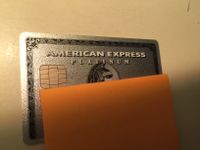
What about the Amex Gold and Platinum cards? Some photos make them look extremely glittery, others show just a flat gloss shine to them. Are they very glittery?
- Mark as New
- Bookmark
- Subscribe
- Mute
- Subscribe to RSS Feed
- Permalink
- Report Inappropriate Content
Re: Cards that look different than their official photos
CSP is darker in person, BofA cash rewards has a nice metallic finish that you don't see in pics, the United Club has a very grey color that you don't see on Chase's website, The Amex Platinum has a sparkly finish that is not shown online.
Next app: Mortgage in September 2025
- Mark as New
- Bookmark
- Subscribe
- Mute
- Subscribe to RSS Feed
- Permalink
- Report Inappropriate Content
Re: Cards that look different than their official photos
@pdxmike wrote:What about the Amex Gold and Platinum cards? Some photos make them look extremely glittery, others show just a flat gloss shine to them. Are they very glittery?
The Platinum is VERY glittery.
Next app: Mortgage in September 2025
- Mark as New
- Bookmark
- Subscribe
- Mute
- Subscribe to RSS Feed
- Permalink
- Report Inappropriate Content
Re: Cards that look different than their official photos
I'm disappointed that the BCE/BCP isn't fully see through.
The frosted upper area really ruins the moment.
