- myFICO® Forums
- This 'n' That
- SmorgasBoard
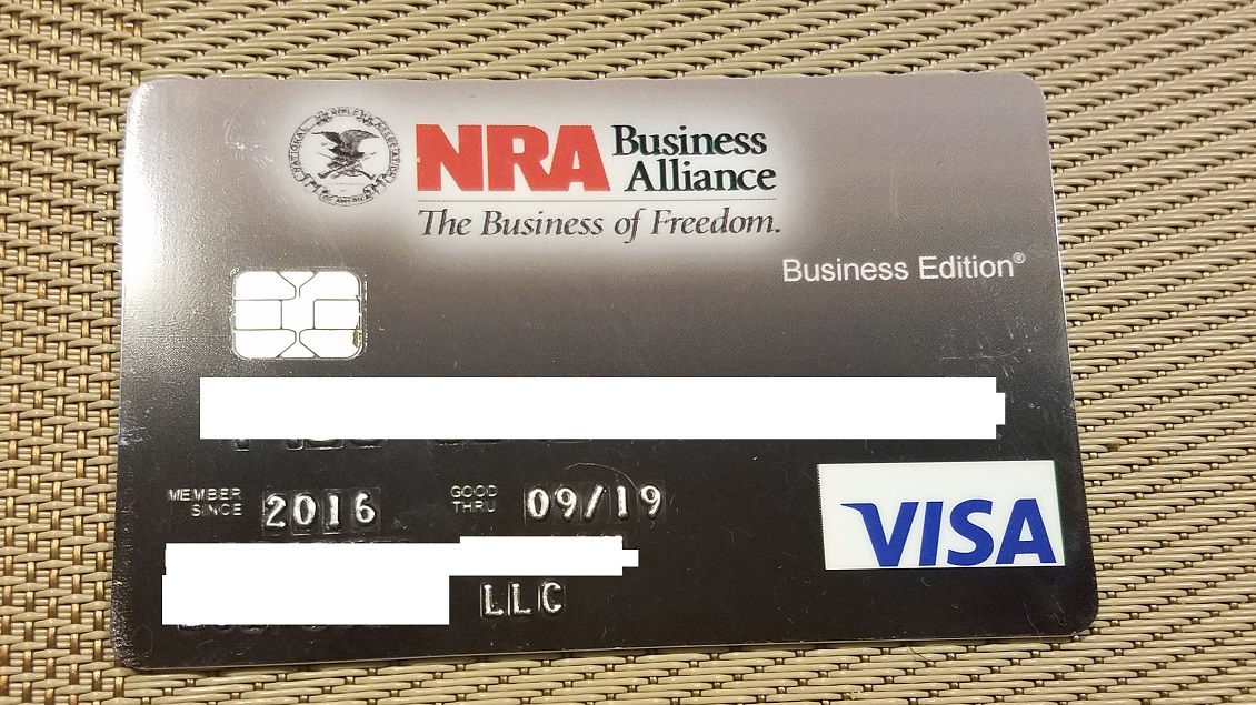
- This card sure is ugly.
- Subscribe to RSS Feed
- Mark Topic as New
- Mark Topic as Read
- Float this Topic for Current User
- Bookmark
- Subscribe
- Mute
- Printer Friendly Page
This card sure is ugly.
Is your credit card giving you the perks you want?
Browse credit cards from a variety of issuers to see if there's a better card for you.
- Mark as New
- Bookmark
- Subscribe
- Mute
- Subscribe to RSS Feed
- Permalink
- Report Inappropriate Content
This card sure is ugly.
boy this is just crazy, its like something that came from the trash.
- Mark as New
- Bookmark
- Subscribe
- Mute
- Subscribe to RSS Feed
- Permalink
- Report Inappropriate Content
Re: This card sure is ugly.
- Mark as New
- Bookmark
- Subscribe
- Mute
- Subscribe to RSS Feed
- Permalink
- Report Inappropriate Content
Re: This card sure is ugly.
That is pretty ugly. They didn't even bother to put the VISA logo on the background of the card.
- Mark as New
- Bookmark
- Subscribe
- Mute
- Subscribe to RSS Feed
- Permalink
- Report Inappropriate Content
Re: This card sure is ugly.
That card looks pretty ugly, Its already scratched up and you just got it; Id hate to see it in a few months. They need better matterials
- Mark as New
- Bookmark
- Subscribe
- Mute
- Subscribe to RSS Feed
- Permalink
- Report Inappropriate Content
Re: This card sure is ugly.
@WuXing5 wrote:boy this is just crazy, its like something that came from the trash.
I don't understand how an organization or company can give out a card to its users in such poor condition.
A brown card with a huge, white, box with an un-centered Visa logo on it?
Should've just put "Visa" in white with a blended brown background.If they did that, the card would look decent.
- Mark as New
- Bookmark
- Subscribe
- Mute
- Subscribe to RSS Feed
- Permalink
- Report Inappropriate Content
Re: This card sure is ugly.
Those 3 big letters make it attractive to me....NRA
@WuXing5 wrote:boy this is just crazy, its like something that came from the trash.
EX fico08=809 07/16/23
EQ fico09=812 07/16/23
EX fico09=821 07/16/23
EQ fico bankcard08=832 07/16/23
TU Fico Bankcard 08=840 07/16/23
EQ NG1 fico=802 04/17/21
EQ Resilience index score=58 03/09/21
Unknown score from EX=784 used by Cap1 07/10/20
- Mark as New
- Bookmark
- Subscribe
- Mute
- Subscribe to RSS Feed
- Permalink
- Report Inappropriate Content
Re: This card sure is ugly.
Whoever decided a PowerPoint Gradient color scheme was a good idea for a credit card needs to be fired immediately and barred from ever creating another monstrosity ever again.
ETA: Probably the same person who was fired at Capital One for designing the old Venture One.
EX FICO (AMEX): 728 (4/29/17) | TU FICO (Discover): 737 (4/7/17) | EQ FICO (Citi): 746 (3/28/17)
- Mark as New
- Bookmark
- Subscribe
- Mute
- Subscribe to RSS Feed
- Permalink
- Report Inappropriate Content
Re: This card sure is ugly.
@14Fiesta wrote:Whoever decided a PowerPoint Gradient color scheme was a good idea for a credit card needs to be fired immediately and barred from ever creating another monstrosity ever again.
ETA: Probably the same person who was fired at Capital One for designing the old Venture One.
The old Venture One posted looks 5x better than this NRA card.
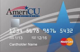
The ugliest card I can think of is AmeriCU Credit Union's debit cards. What kind of a debit card has a flat group of bubble numbers on the front? Let's see if I can find the image. Plus the stickers they put on them for 'activation' never want to come off; thus, there was scratches all over it from day one, and the cards aren't even EMV ready yet.
This is a picture of their credit card, so it has the EMV chip, but just remove the EMV chip and this is literally what their debit card looks like.
- Mark as New
- Bookmark
- Subscribe
- Mute
- Subscribe to RSS Feed
- Permalink
- Report Inappropriate Content

